Create Anything
Claim, documentation Configurator
Below is the detailed documentation for configurator
Below is the detailed documentation for configurator
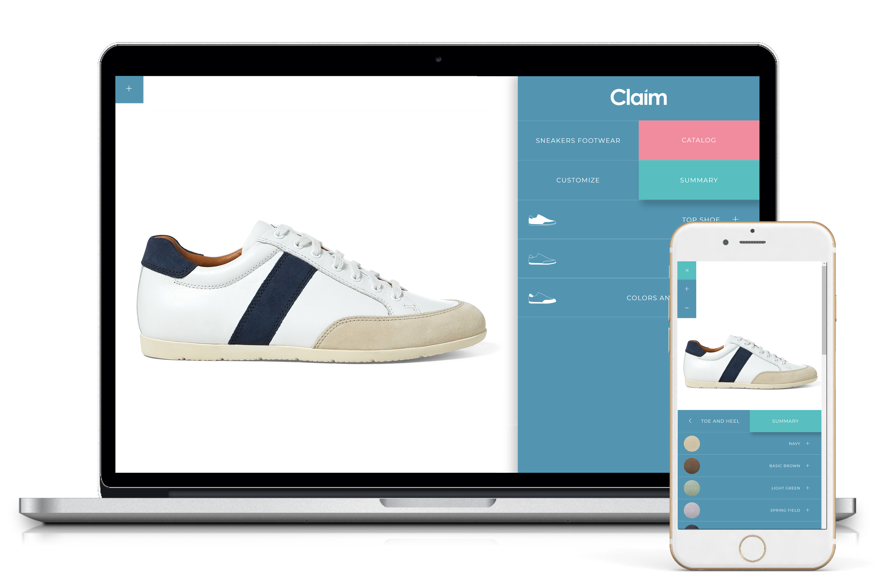
<div class="container">
	<div class="row">
		<div class="col-md-8 col-sm-12">...</div>
		<div class="col-md-4 col-sm-12">...</div>
	</div>
</div>
In the left column there's product image, in the right column is the slide menu.
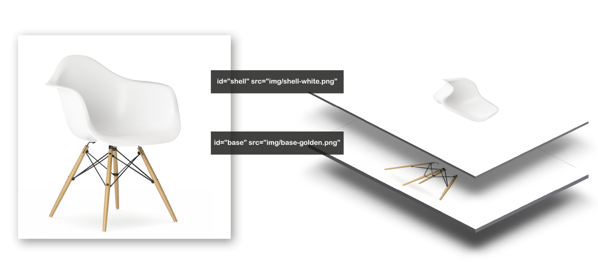 In the left column you can set product. Add a product composed by PNG image subdivise in layer, in img folder and call back these as the exaple below.
<!--left column-->
<div id="desk-sx" class="col-sm-12 col-md-8 tail">
	<img id="shell" src="img/shell-white.png" alt="" class="img-responsive"/>
	<img id="base" src="img/base-golden.png" alt="" class="img-responsive"/>
</div>
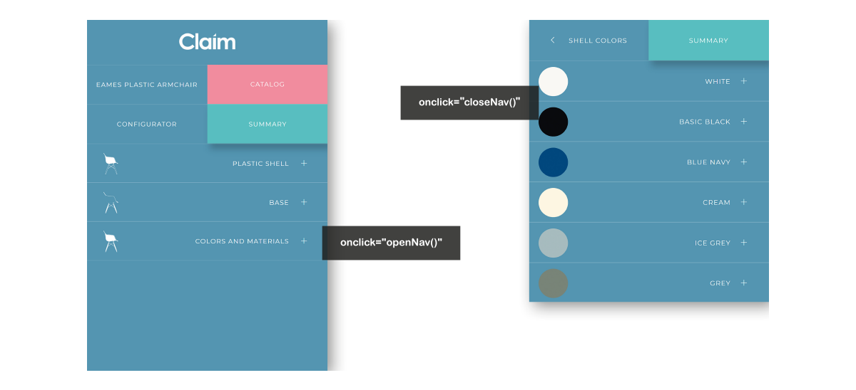 Slide menu allow you to navigate throw the configurator's sections without lose the product view.
<li onclick="openNav()" class="list-group-item col-xs-12">
	<span class="chat-img pull-left">
		<img width="50" class="img-responsive" alt="" src="img/icon-1.svg">
	</span>
	<span>Plastic Shell</span>
	<span class="tab-space"></span><span class="ti-plus"></span>
</li>
File navigation.js
function openNav() {
	document.getElementById("mySidenav").style.width = "0%";
	document.getElementById("mySidenav-2").style.width = "100%";
	}
File style.css
.sidenav {
	height: 100%;
	width: 100%;
	position: absolute;
	z-index: 1;
	top: 0;
	left: 0;
	overflow-x: hidden;
	transition: 0.2s;
	background-color: #5395b1;
	}
.sidenav-2 {
	height: 100%;
	width: 0;
	position: absolute;
	z-index: 1;
	top: 0;
	right: 0;
	overflow-x: hidden;
	transition: 0.2s;
	background-color: #5395b1;
	}
Set the "block code", as the example above, if you want customize navigation system.
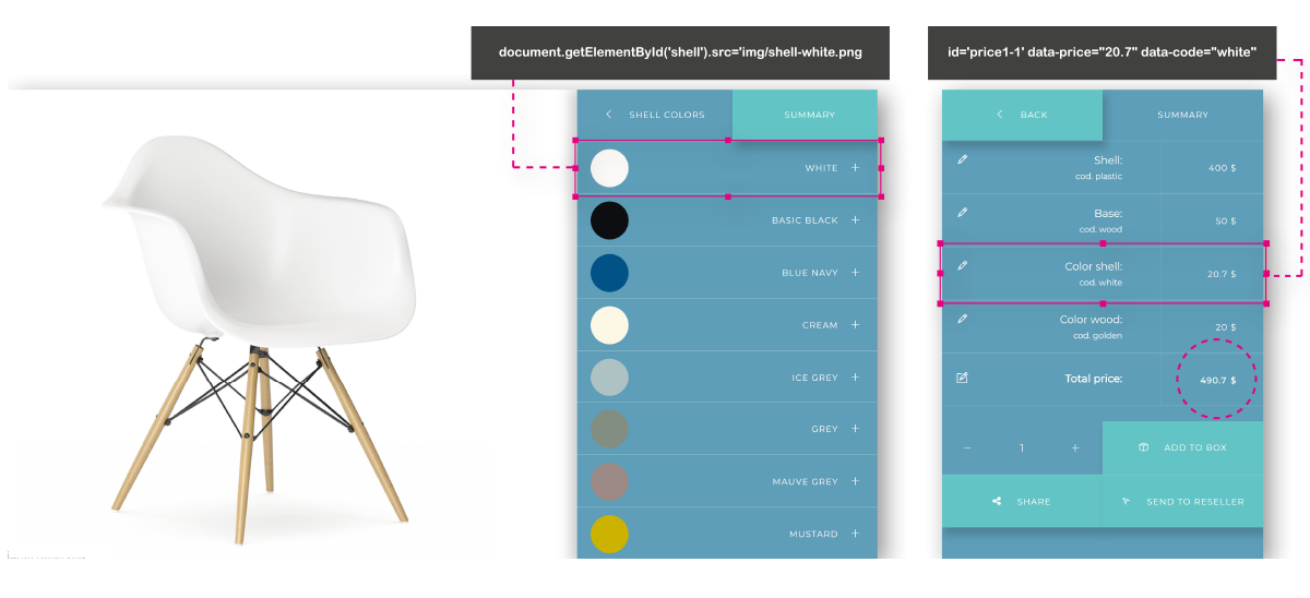 You can set all attributes you want with this "block of code" element.
<li onclick="document.getElementById('shell').src='img/shell-white.png'" class="text list-group-item col-xs-12"  id='price1-1' data-price="20.7" data-code="white">
	<span class="chat-img pull-left"><img class="img-circle img-responsive" width="50" alt="" src="img/white.jpg"/></span>
	white<span class="tab-space"><span><span class="ti-plus"></span>
</li>
<li onclick="document.getElementById('base').src='img/base-golden.png';" class="text list-group-item col-xs-12" id='price0-1' data-price="50" data-code="wood">
	<span class="chat-img pull-left">
	<img width="50" class="img-responsive" alt="" src="img/icon-10.svg"></span>wood base
	<span class="tab-space"></span>span class="ti-plus"></span>
</li>
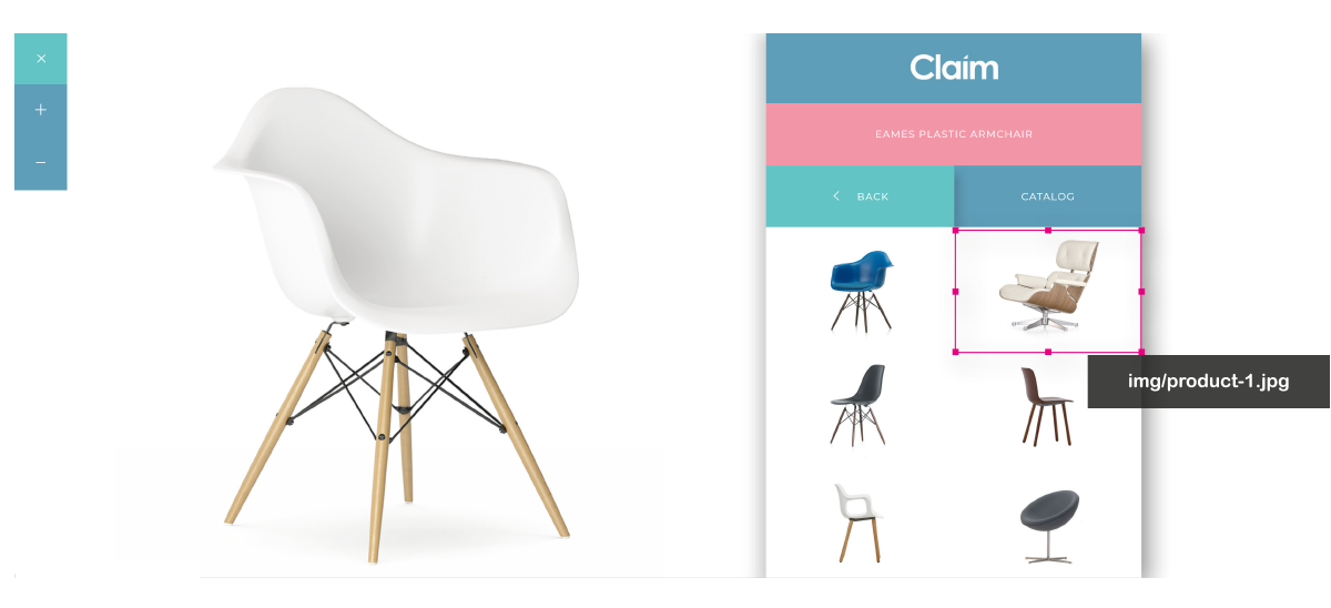 Thanks to catalog section Claim allow to add infinite product in your template by the product grid.
<div  class="col-xs-6 product-tail frame">
	<img class="image-responsive" alt="" src="img/product-1.jpg"/>
</div>
<li onclick="closeNav18()" class=" list-group-summary col-xs-8">
	<span class="chat-img pull-left">
		<span class="ti-pencil"></span><span class="tab-space"></span>
	</span>
		Shell:<br>
	<span class="list-group-code" id="code_6"></span>
</li>
<li onclick="closeNav18()" class=" list-group-item col-xs-4">
	<p id='total_5'>0.00 $</p>
</li>
<!--empty view box-->
<div class="box-view"></div>
	<!--front-view-->
	<div id="desk-sx" class="front-view col-sm-12 col-md-8 tail">
	<img src="img/front-image.png" alt="" class="img-responsive"/>
	<img id="base" src="img/sole-white.png" alt="" class="img-responsive"/>
	<img id="canvas" src="img/front-canvas-kiwi.png" alt="" class="img-responsive"/>
	<img id="insert" src="img/insert-red.png" alt="" class="img-responsive"/>
</div>
<!--top-view-->
<div id="desk-sx-side" class="top-view col-sm-12 col-md-8 tail">
	<img src="img/top-image.png" alt="" class="img-responsive"/>
	<img id="base-side" src="img/top-sole-white.png" alt="" class="img-responsive"/>
	<img id="canvas-side" src="img/top-canvas-kiwi.png" alt="" class="img-responsive"/>
	<img id="insert-side" src="img/top-insert-red.png" alt="" class="img-responsive"/>
</div>
<!--back-view-->
<div id="desk-sx-back" class="back-view col-sm-12 col-md-8 tail">
	<img src="img/back-image.png" alt="" class="img-responsive"/>
	<img id="base-back" src="img/back-sole-white.png" alt="" class="img-responsive"/>
	<img id="canvas-back" src="img/back-canvas-kiwi.png" alt="" class="img-responsive"/>
	<img id="insert-back" src="img/back-insert-red.png" alt="" class="img-responsive"/>
</div>
$(document).ready(function() {
    $('.animate').bind('click', function() {
         if($(this).hasClass('activetop')) {
         	var $container = $( "div.container" ).replaceWith($top_view);
            $('div.top-view').hide();
            $('div.front-view').hide();
            $('div.back-view').show();
        }
        if($(this).hasClass('activeside')) {
            var $container = $( "div.container" ).replaceWith($top_view);
			$('div.top-view').show();
            $('div.front-view').hide();
            $('div.back-view').hide();
        }
         if($(this).hasClass('activefront')) {
         	var $container = $( "div.container" ).replaceWith($front_view);
            $('div.top-view').hide();
            $('div.front-view').show();
            $('div.back-view').hide();
        }
    });
});
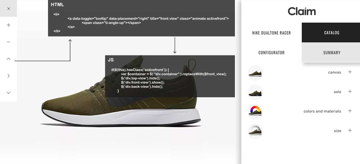
<!--utility bar-->
<nav class="navbar navbar-fixed-left navbar-minimal animate">
	<div class="navbar-toggler animate">
		<span class="menu-icon ti-plus"></span>
	</div>
	<ul class="navbar-menu animate">
		<li>
			<a id="zoomIn" class="animate">
				<span class="ti-plus"></span>
			</a>
		</li>
		<li>
			<a id="zoomOut" class="animate">
				<span class="ti-minus"></span>
			</a>
		</li>
		<li>
			<a data-toggle="tooltip" data-placement="right" title="front view" class="animate activefront">
				<span class="ti-angle-up"></span>
			</a>
		</li>
		<li> <a data-toggle="tooltip" data-placement="right" title="top view" class="animate activetop">
				<span class="ti-angle-right"></span>
			</a>
		</li>
		<li>
			<a data-toggle="tooltip" data-placement="right" title="back view" class="animate activeback">
				<span class="ti-angle-down"></span>
			</a>
		</li>
	</ul>
</nav>
zoom image
//zoom image
$(document).ready(function(){
    $("#zoomIn").click(function(){
        var div = $(".tail img");
        startAnimation();
        function startAnimation(){
            div.css({"transform": "scale(1.3)",
					 "-webkit-transform": "scale(1.3)",
					 "-moz-transform": "scale(1.3)",
					 "transition": "all 0.3s",
					 "-webkit-transition": "all 0.3s",
					 "-moz-transition": "all 0.3s"});
        }
    });
});

$(document).ready(function(){
    $("#zoomOut").click(function(){
        var div = $(".tail img");
        startAnimation();
        function startAnimation(){
            div.css({"transform": "scale(1)",
					 "-webkit-transform": "scale(1)",
					 "-moz-transform": "scale(1)",
					 "transition": "all 0.3s",
					 "-webkit-transition": "all 0.3s",
					 "-moz-transition": "all 0.3s"});
        }
    });
});
change views
//switch views

$(document).ready(function() {
    $('.animate').bind('click', function() {
         if($(this).hasClass('activeback')) {
         	var $container = $( "div.container" ).replaceWith($back_view);
            $('div.top-view').hide();
            $('div.front-view').hide();
            $('div.back-view').show();
        }
        if($(this).hasClass('activetop'')) {
            var $container = $( "div.container" ).replaceWith($top_view);
			$('div.top-view').show();
            $('div.front-view').hide();
            $('div.back-view').hide();
        }
         if($(this).hasClass('activefront'')) {
         	var $container = $( "div.container" ).replaceWith($front_view);
            $('div.top-view').hide();
            $('div.front-view').show();
            $('div.back-view').hide();
        }
    });
});
<ul class="list-group row">
	<li onclick="document.getElementById('base').src='img/sole-white.png'" class="text list-group-item col-xs-12 activex select-2" id='price0-1' data-price="20" data-code="basic soles">
		<span class="chat-img pull-left"> <img width="50" class="img-responsive img-circle" alt="" src="img/icon-8.jpg"></span>Basic Sole
		<span class="tab-space"></span><span class="ti-plus"></span>
	</li>
	<li onclick="document.getElementById('base').src='img/sole-running-white.png'" class="text list-group-item col-xs-12 select-2" id='price0-2' data-price="60" data-code="racer air sole">
		<span class="chat-img pull-left"> <img width="50" class="img-responsive img-circle" alt="" src="img/icon-9.jpg">
		</span>Racer air Sole <span class="tab-space"></span><span class="ti-plus"></span>
	</li>
</ul>
//Select Sole
$('li.select-2').click(function(){
    $('li.select-2').removeClass('activex');
    $(this).addClass('activex');
});
.top-logo { height: 13%; }
<i class="icon ti-twitter"></i>